Power BI is a very powerful tool, however making a report that looks clean and still have usability in center can be difficult. In this article we will look at the possibility for using toggle buttons to help keep a report clean and simple, and still pack advanced features into it.
In an earlier article we exported data from yahoo finance and made a very simple visualization of the price looking at date and close price. Now a colleague wants to be able to follow the opening price. You could just add the opening price to the same graph. However, it can quickly become messy when we add to many lines to a graph.
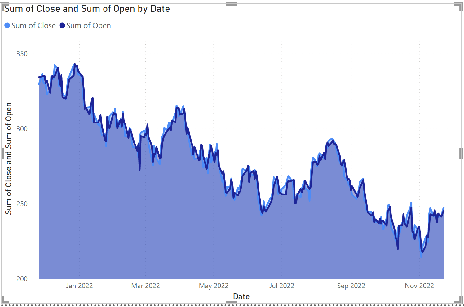
Another option is to place two graphs in the report tab one with open and one with close.
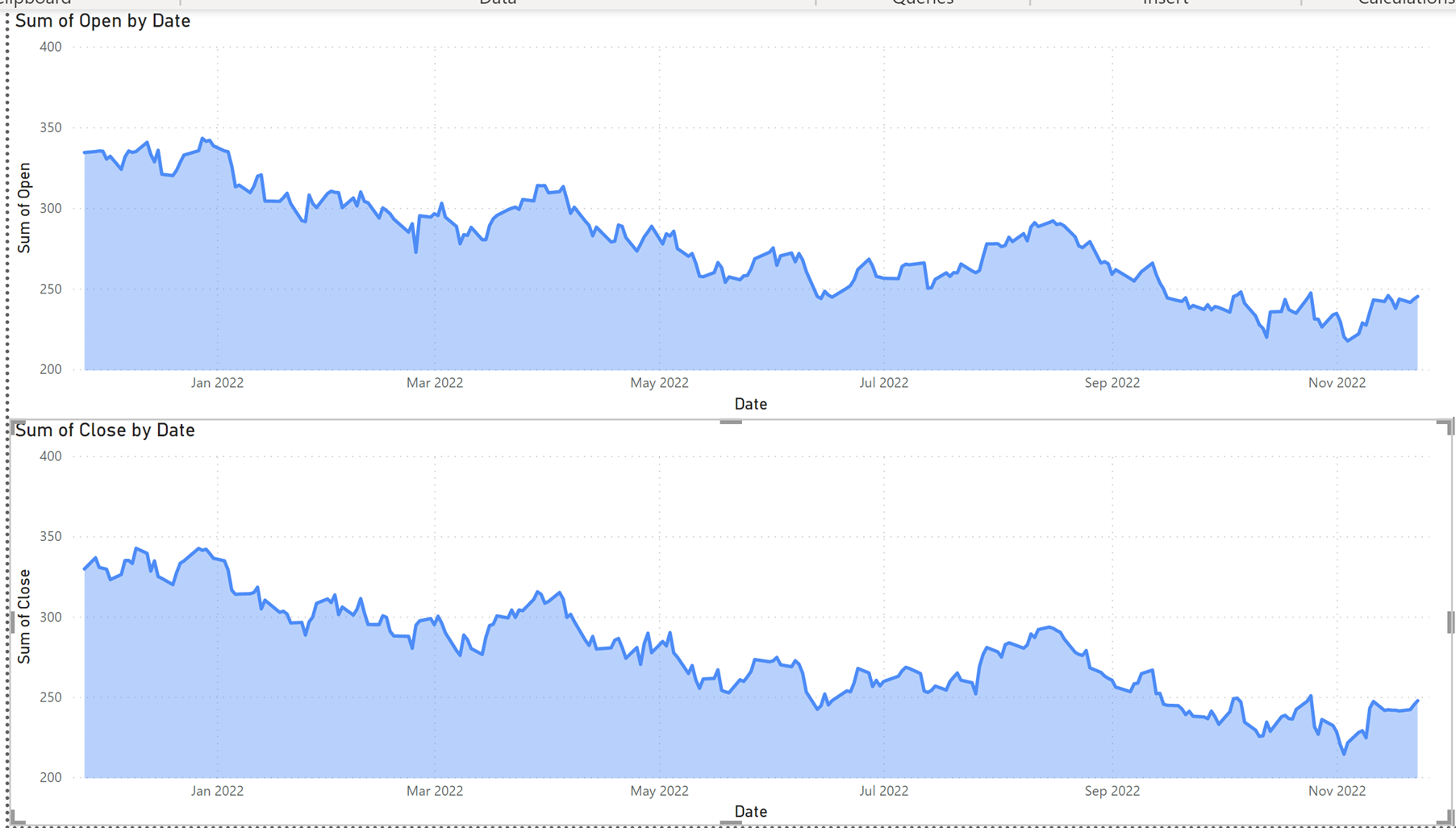
This does add to the readability and you can enter focus mode on the visualization, but it is still not good. So how do we keep the size of the graph without making it too messy?
We could make another tab and have one tab for each graph switching by using the tabs or bookmark buttons. Alternatively, we can place two graphs on top of each other and use selection, bookmarks, and toggle buttons to create a clean report with the option of view either open or close figures.

First, we need to create a button. To create our button, we need to add two shapes and one button: one pill shape, and one oval and one clear button. The pill and the button we will resize to 40x80, and the oval we will resize to 35x35. We are going to mark the two shapes and the button, and group them together. This we do by right clicking the shapes, Group --> Group, now you should have button looking like the one beneath.
Now, copy paste this visual and adapt it to be the mirror of the first shape:

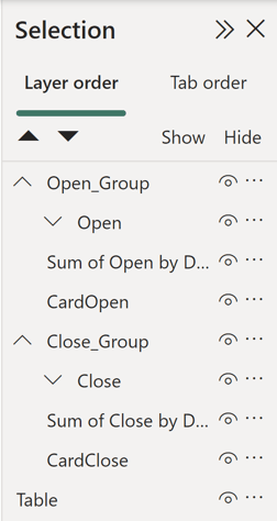
Now we have two buttons one for open and one for close, next we go to View->Selection and rename the two groups to Open and Close:
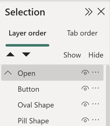 It is important that the order is as mine, with the button being the upper one, next the oval and last the pill.
Now we want to copy paste the graph, and the card we made earlier showing the LastClose, for the card we need to make a measure for LastOpen.
Here we use the same measure as we did with LastClose, and change Close with Open:
LastClose = CALCULATE(AVERAGE('Hist Price'[Close]), 'Hist Price'[Date] = MAX('Hist Price'[Date]))
Now we want to expand the groups, so we have Open_Group and Close_Group.
To group mark the lines in the selection tab you want to group together and press the three dots or right click. Now you have the option to group them together.
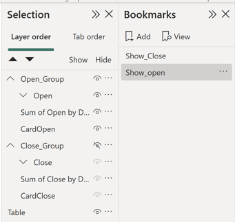
Next, we need to make two bookmarks one for show_open and one for show_close, this we do by pressing the eye at the Open_Group, this hides this group. Save a bookmark of this selection, and do the opposite with close, so Open is displayed and Closed is hidden. When the bookmarks are done, click the three dots and make sure data is not checked. This should not make a difference for this case. Nonetheless, we do not want the data selection on the page being a part of the bookmark.
Now we need to assign these bookmarks to our buttons, we do this by marking the button in our selection, turn the actions on in the format pane, choose bookmark as type, and choose the bookmark to use.
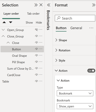
Here I added an action to the button in the Close_Group, thus it must display the Show_Open when I click it.
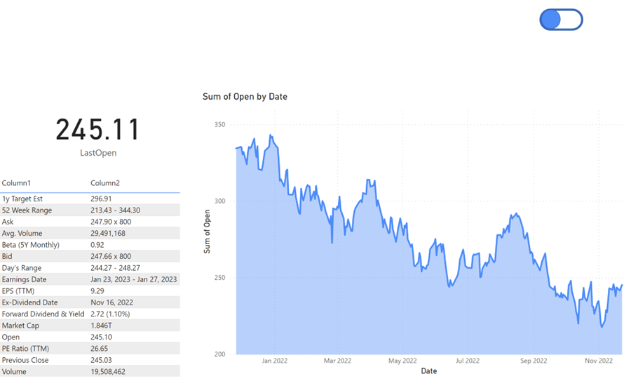
After setting this up you will have a report that allows you to toggle between two reports using a button. Further the user will not be confused with more tabs:
When a report is not published you need to hold down Ctrl while pressing the button.
I hope this dive into creating custom toggle buttons in Power BI have inspired some of you. If you have any question, please reach out and contact us.
.jpg)